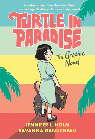
Meet Savanna Ganucheau!
Meet Savanna Ganucheau! Savanna is the artist behind the new graphic novel adaptation of Jennifer L. Holm’s Newbery Honor–winning Turtle in Paradise.
Savanna got her start in comics by self-publishing and selling her work in small comic book shops around New Orleans. Savanna’s artwork has appeared in notable publications, including Jem and the Holograms, Adventure Time, and Lumberjanes. Her first graphic novel, Bloom, is published by First Second. Here, Savanna shares her process for bringing Turtle in Paradise to life.
What went into presenting an accurate depiction of 1930s Key West?
GANUCHEAU: I did a lot of research, but Jenni was also able to help me a lot. She had done tons of research for the novel, and I was able to take advantage of that. I had a great time researching clothing. I stayed away from catalogs of the time and focused more on photos from the 1930s of children in rural areas.
Did any of the characters, creatures, or locations present a particular challenge for you?
GANUCHEAU: Definitely the docks. Boats were another thing that was particularly challenging for me. The sponging boats used in 1930s Key West were rarely photographed, so it was difficult for me to find a comprehensive reference that wasn’t a vague side view. And in the 1940s, Key West saw a huge boom in the shrimping industry, which took over most of the sponging industry, so I couldn’t even use photos taken at a later time. Basically, if I saw shrimping boats in a picture, I knew it was from the 1940s and didn’t use it.
Why are comics such a good medium for historical fiction?
GANUCHEAU: Showing our past through images and stories (real or fictional) is a wonderful opportunity for people to relate to historical events in a very human way. I think people have trouble being invested in certain eras of time. Showing the day-to-day life and interactions between characters can help people feel involved in that history and be willing to learn more about it.
In this new adaptation, the color palette and shapes of panels change when looking at the past. How did you and colorist Lark Pien choose how to differentiate the timelines?
GANUCHEAU: We talked about a lot of options when it came to differentiating the flashbacks from the present. In addition to changing up the panel borders, I told Lark I wanted to evoke a sepia-tone feel, and we agreed that we wanted it to feel more creative. Lark did amazing work making the colors memorable. I think what she did with the pink color hold on the balloons is unique and makes the flashback pages stand out.
On page 43, we see Key West as the kids explore the docks. How much of this was drawn from reference materials, and how much was imagination? Telling a story set in a real place, did you feel pressure to stay accurate to the historical setting?
GANUCHEAU: Pressure from myself, for sure. Haha. I absolutely wanted it to be accurate. I’m a huge fan of historical fiction, and while there are a few anachronisms in the book (clothing, mostly), I tried to make it as accurate as I could. The docks were particularly hard because they simply do not exist in the same capacity as they did in the 1930s. And there’s really only a small trace of their layout in the documents I found. (I found some Sanborn Maps that gave me a vague idea.) For this scene, I used a lot of souvenir cards from the 1930s to get a sense of how the turtle kraals looked. In fact, panel one is heavily inspired by one of those cards.